
Oh, to Be Seen
Wilderness Run Vineyards winemaker Harry Pagan came to Southern Northern with an idea for a new wine that included the feeling of looking into a kaleidoscope combined with natural elements from Harry’s family farm in Spotsylvania County Virginia.
With the wine being clear the possibility of using it as a liquid lens was available. Oculum was born.


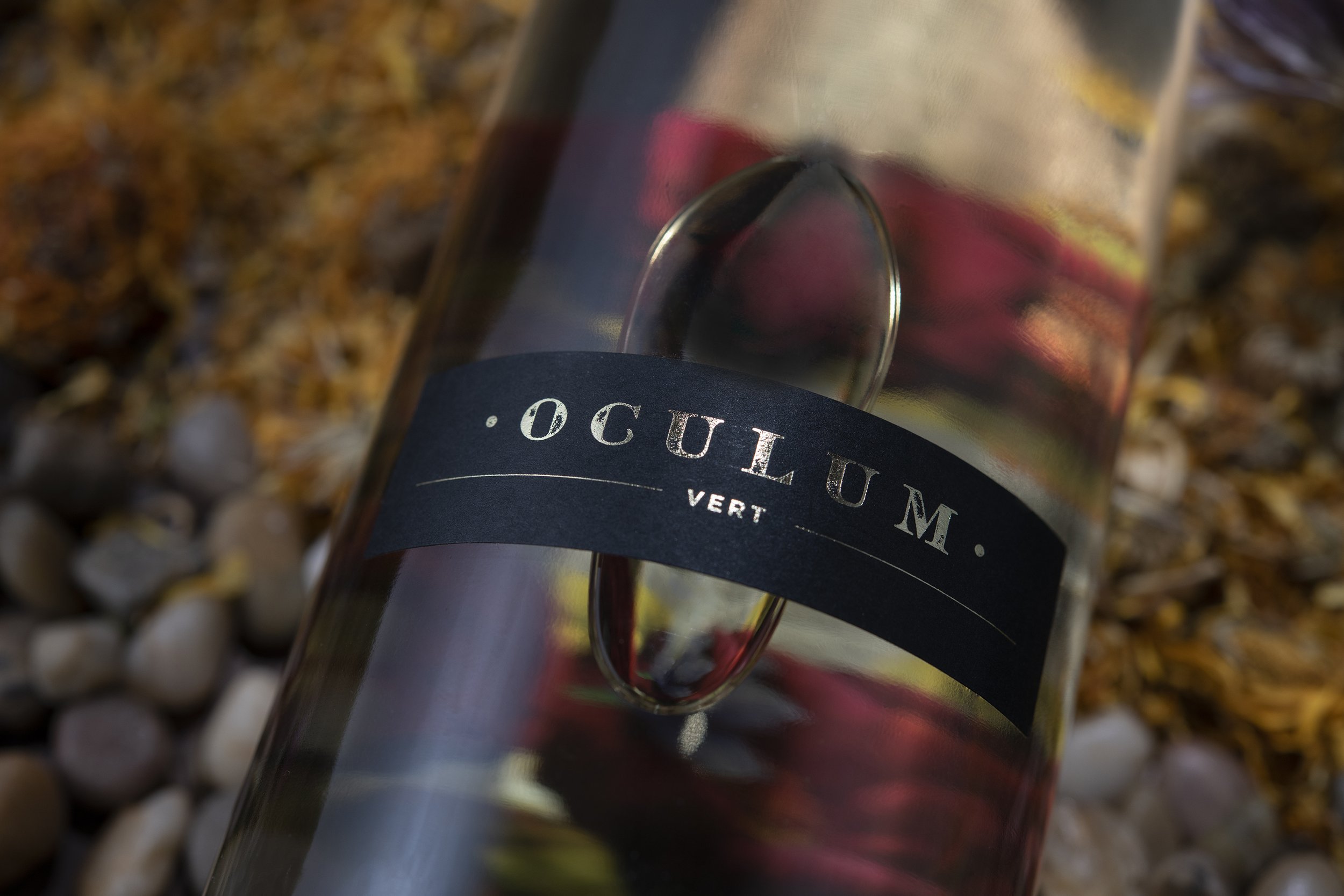
Harry wanted the label to be a visual feast that properly represented the creativity Wilderness Run Vineyards brings to winemaking. Southern Northern hand painted individual elements throughout the label & arranged the items so when viewed through the bottle, they would wrap the viewing area that would constantly change depending on the angle of view.
The liquid lens was used to enhance long distance viewing of the label. The further you stand from the label the more visible the ever watching eye becomes, (which is especially strange when seeing a wall of these bottles following you as you walk around the tasting room).
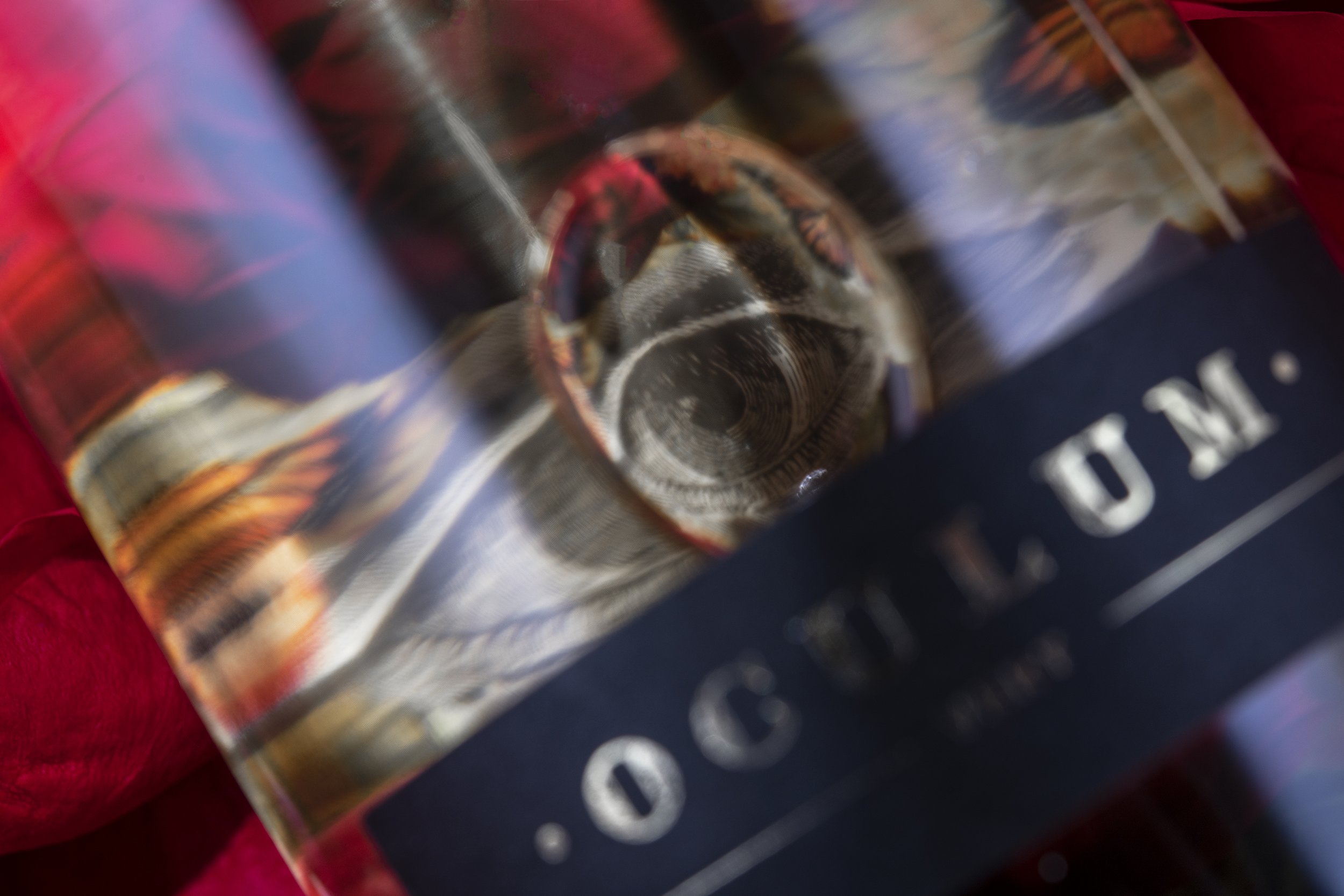
The label was further complicated when you realize the back label image is the inner label in reverse but with the addition of the information card presented in a hot foil stamped gold text. This complicated design took a lot of planning & research to pull off, but the end result is a feast for the eyes & taste buds.