
With a New Name, Everything Changed
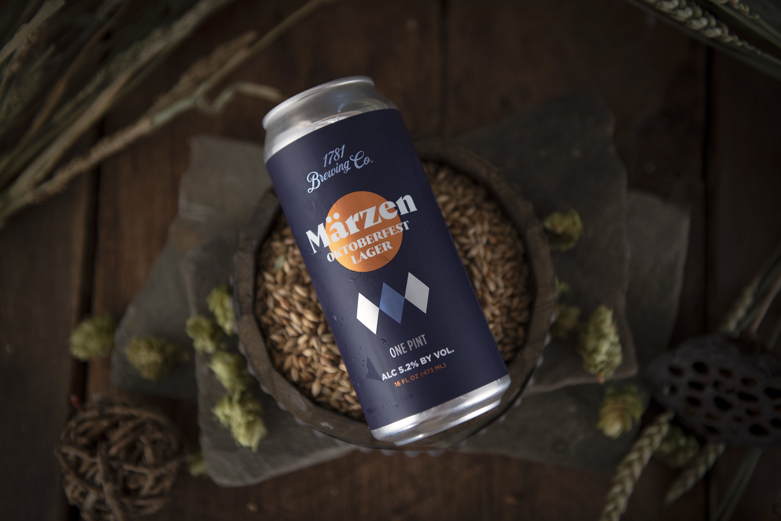
In the spring of 2019 a new lager was just invented that would soon be making its way into tightly sealed Crowlers. The only thing 1781 Brewing needed was a name to call it. After thoughtful consideration, an excited brewmaster Harry Pagan hit us with it. Appalach.


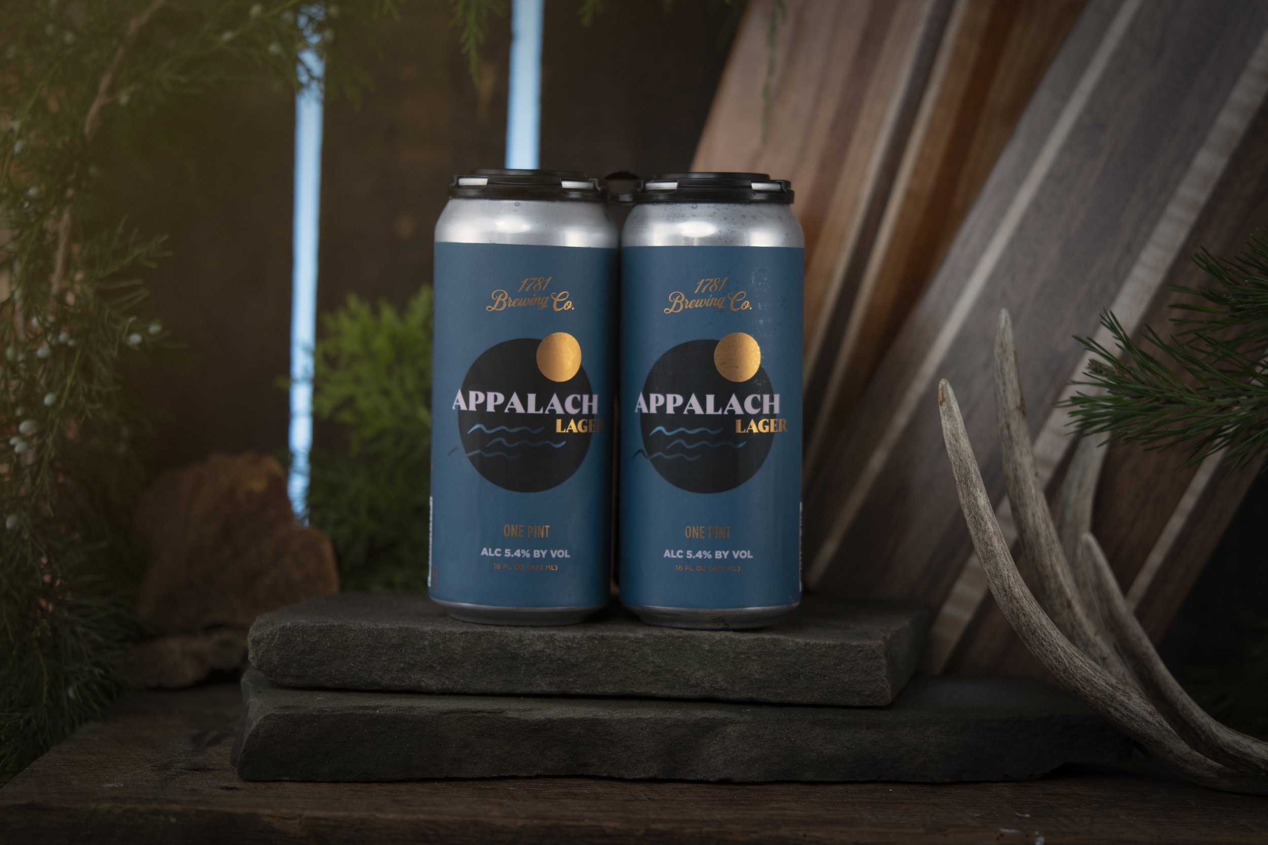

What none of us realized at that moment was when the name Appalach came into existence, a new brand would soon follow. Over time that crowler label was being printed regularly giving everyone the idea that we needed to begin packaging the beer in a 16 OZ format. From that point new brand names emerged centering around the regions that comprise Virginia, leaning less on their original historic figure focused branding and imagery.
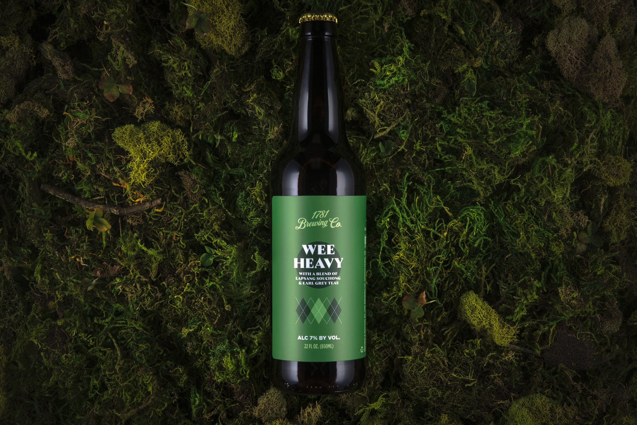
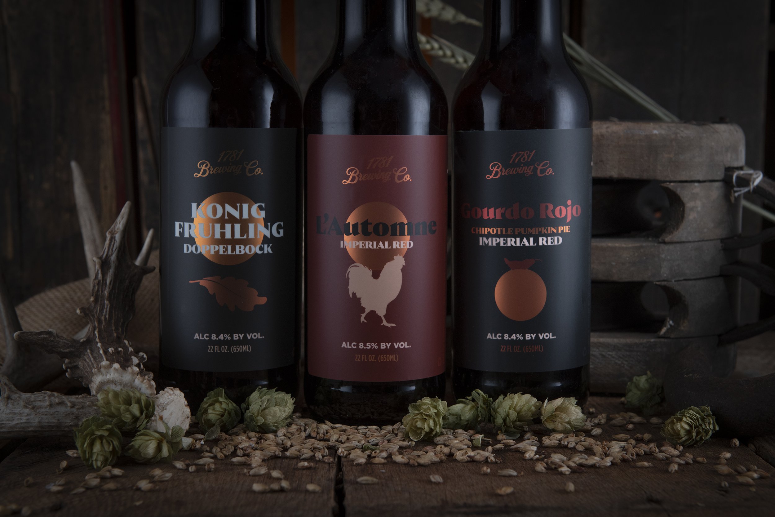
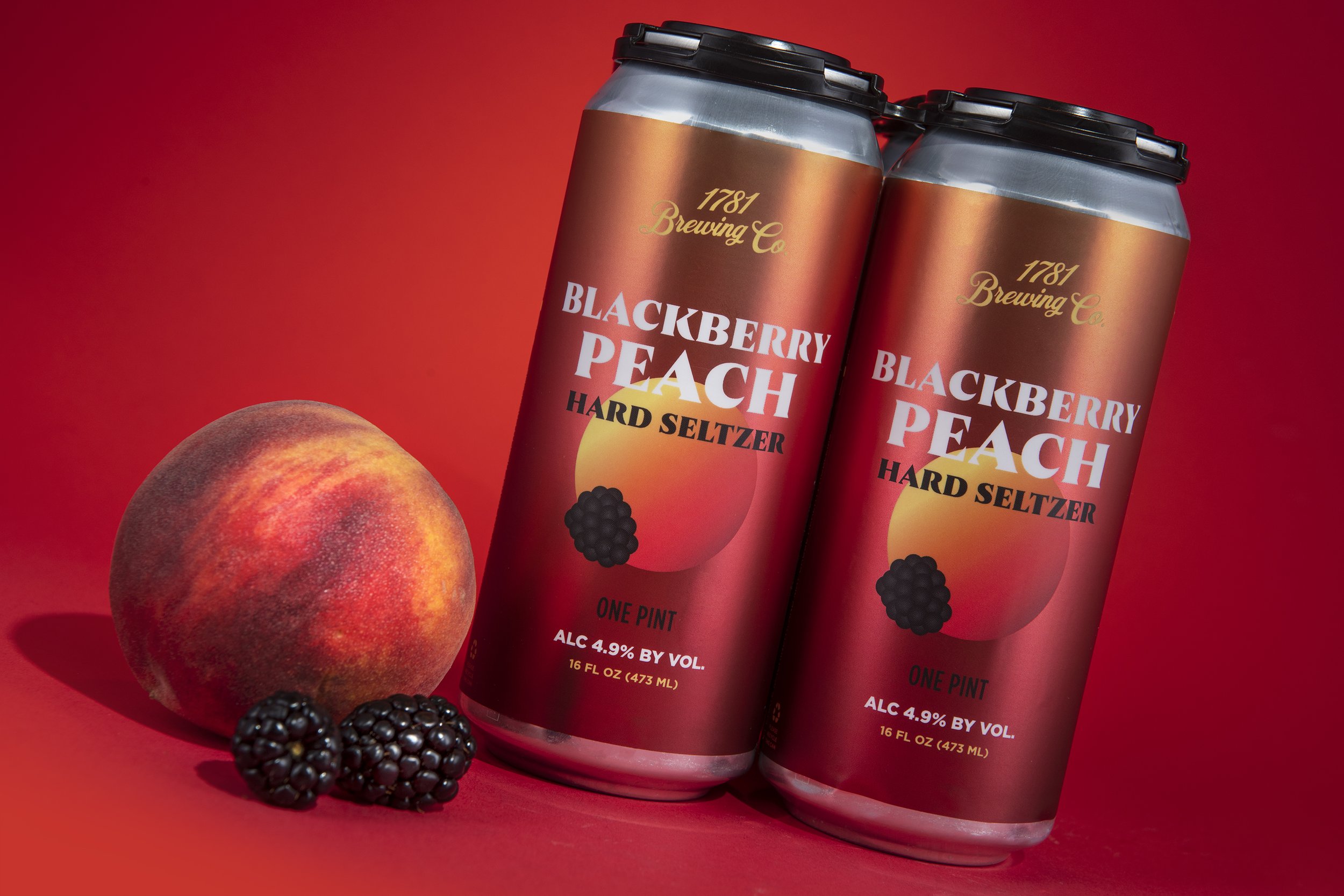
With this geographical concept emerging we began to pair a visual language of flat, ultra simple illustrations, retro typography & color palettes. We developed a repeatable element for all of the cans to share, which is the circle. The circle often times is represented as the sun, the giver of life to all things on the farm & others it will be the fruit ingredients within. The fun challenge of using such a simple shape is to see how many things you can make it become. So far it’s been the sun, the moon, an egg, yeah an egg, a pumpkin, a peach, blackberries, well you get the picture.
Since inception of the new brand, 1781 Brewing has rapidly & easily been able rotate new brands into their portfolio increasing their efficiency & first-to-market ability as a direct result of having a more simplified & cohesive brand.